

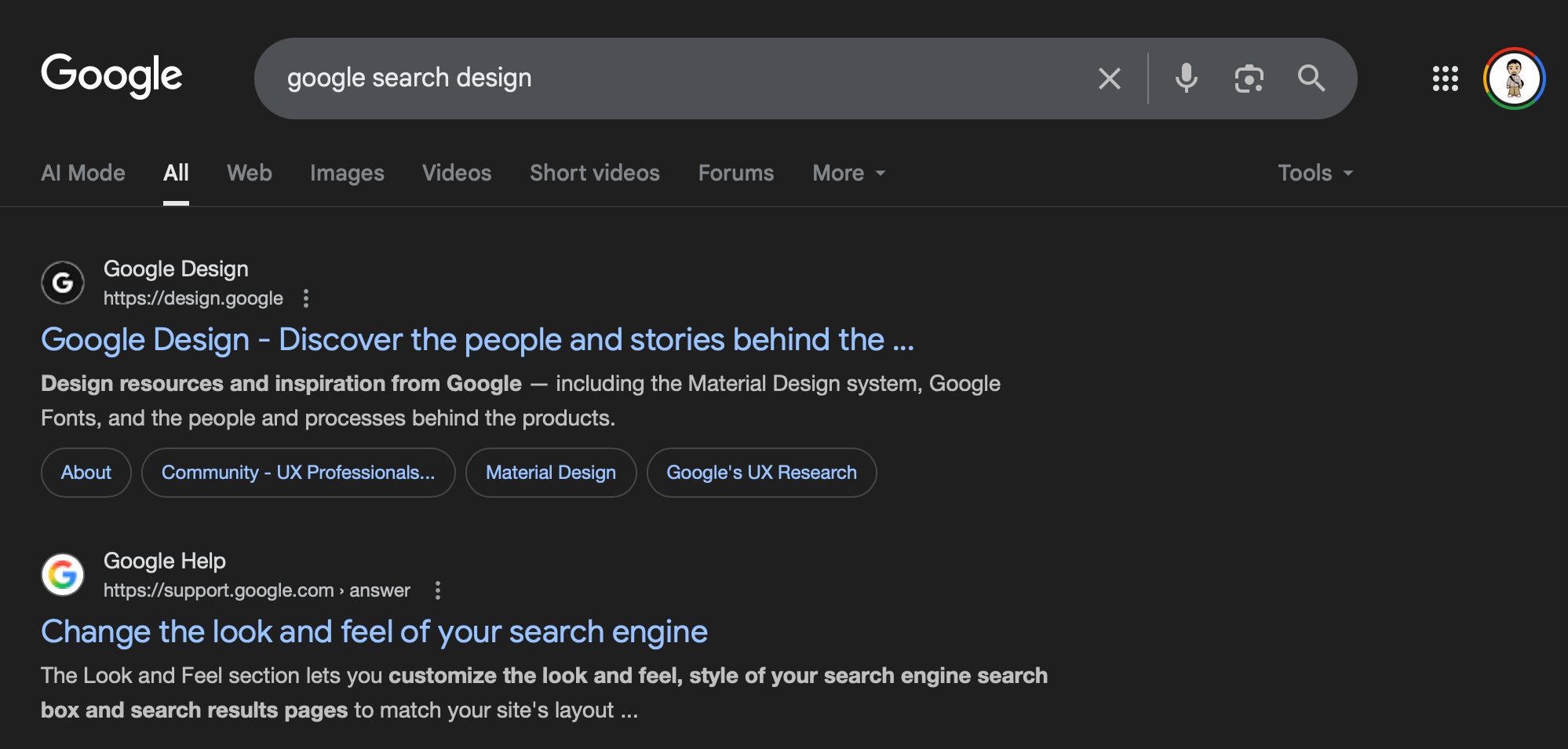
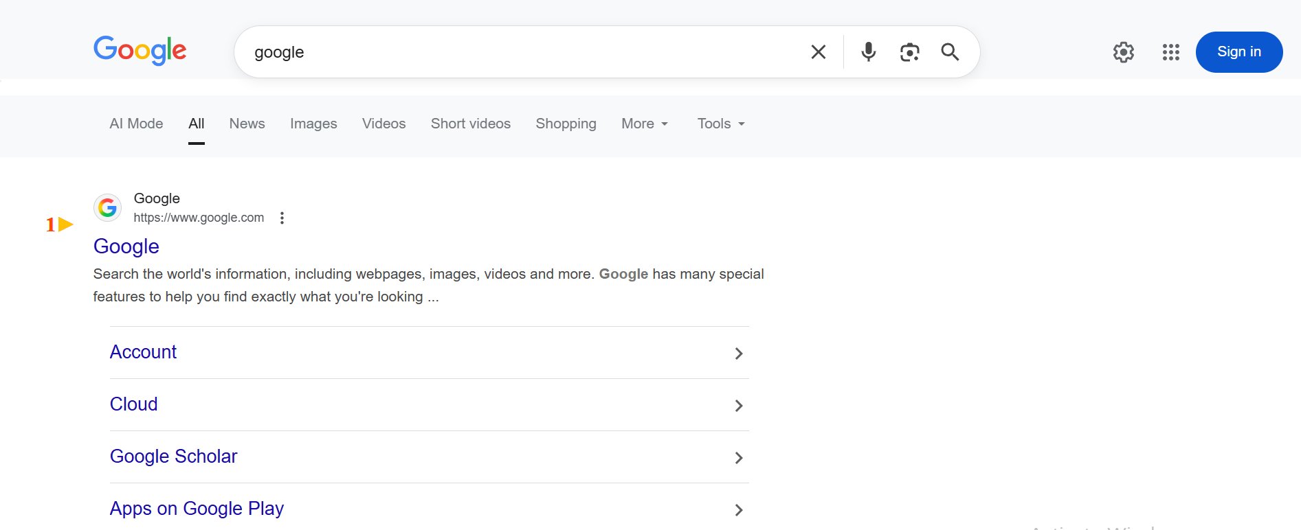
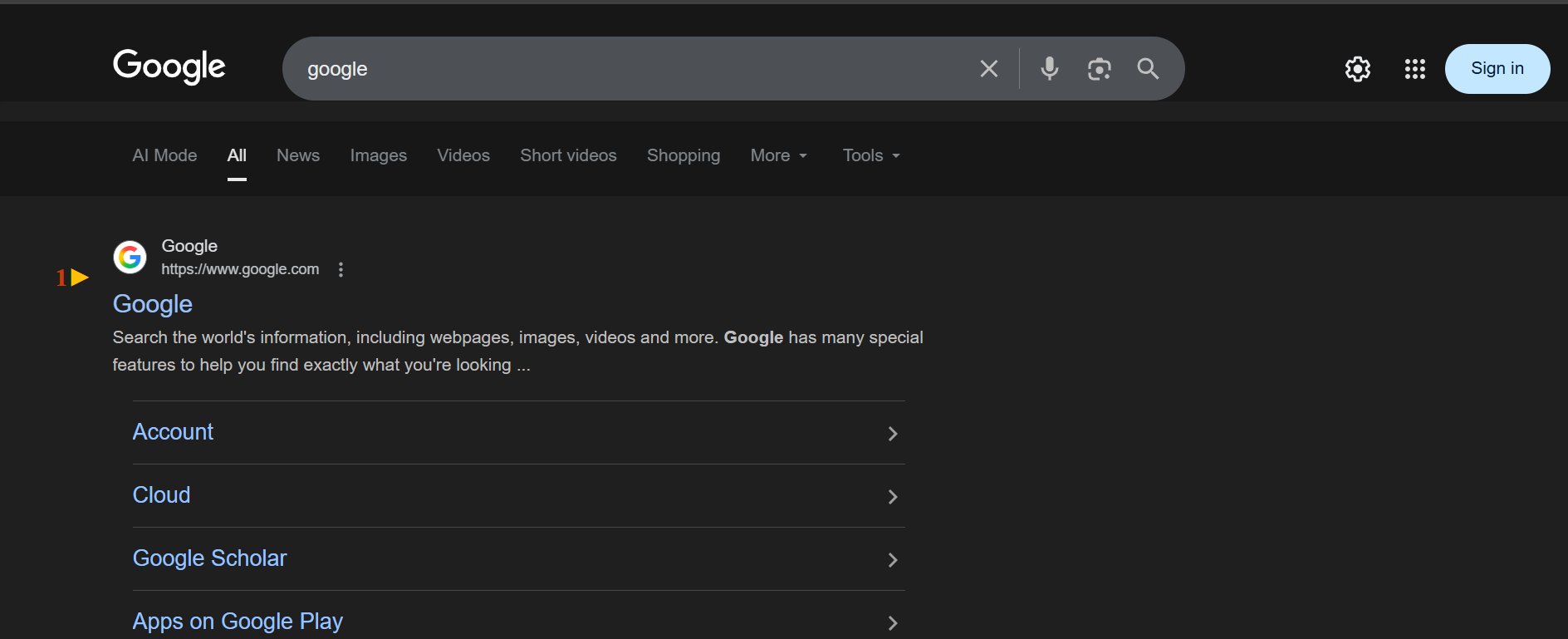
Google is testing a new top bar interface design for the search results page both in light and dark mode. The new design shades the top bar more, so it is more distinct to the search results section.
I spotted a few variations to this afer Punit notified me of one of those variations on X. To be fair, we’ve seen header bar changes over the years, too many to link to, but here is one and here is another but there were tons.
Here is what I was able to replicate:
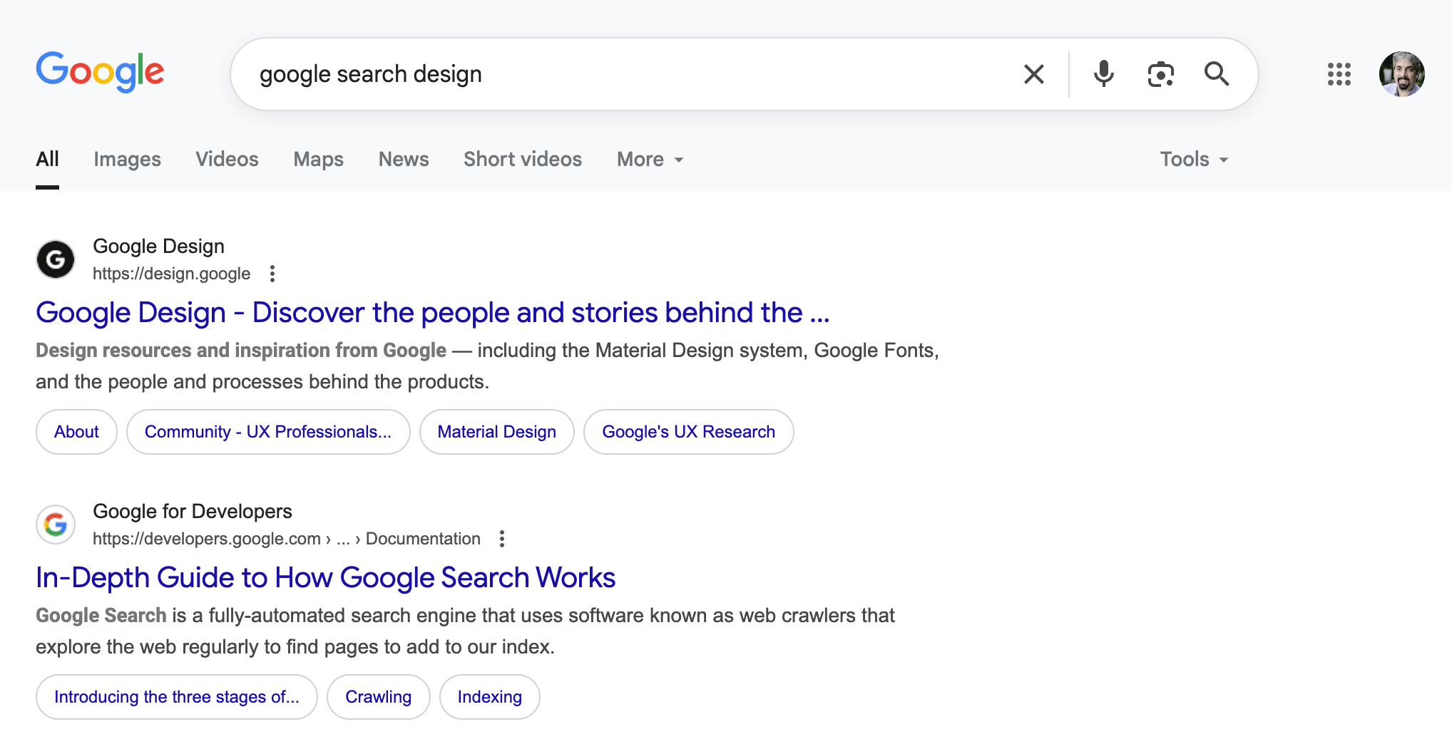
Version One – Light:
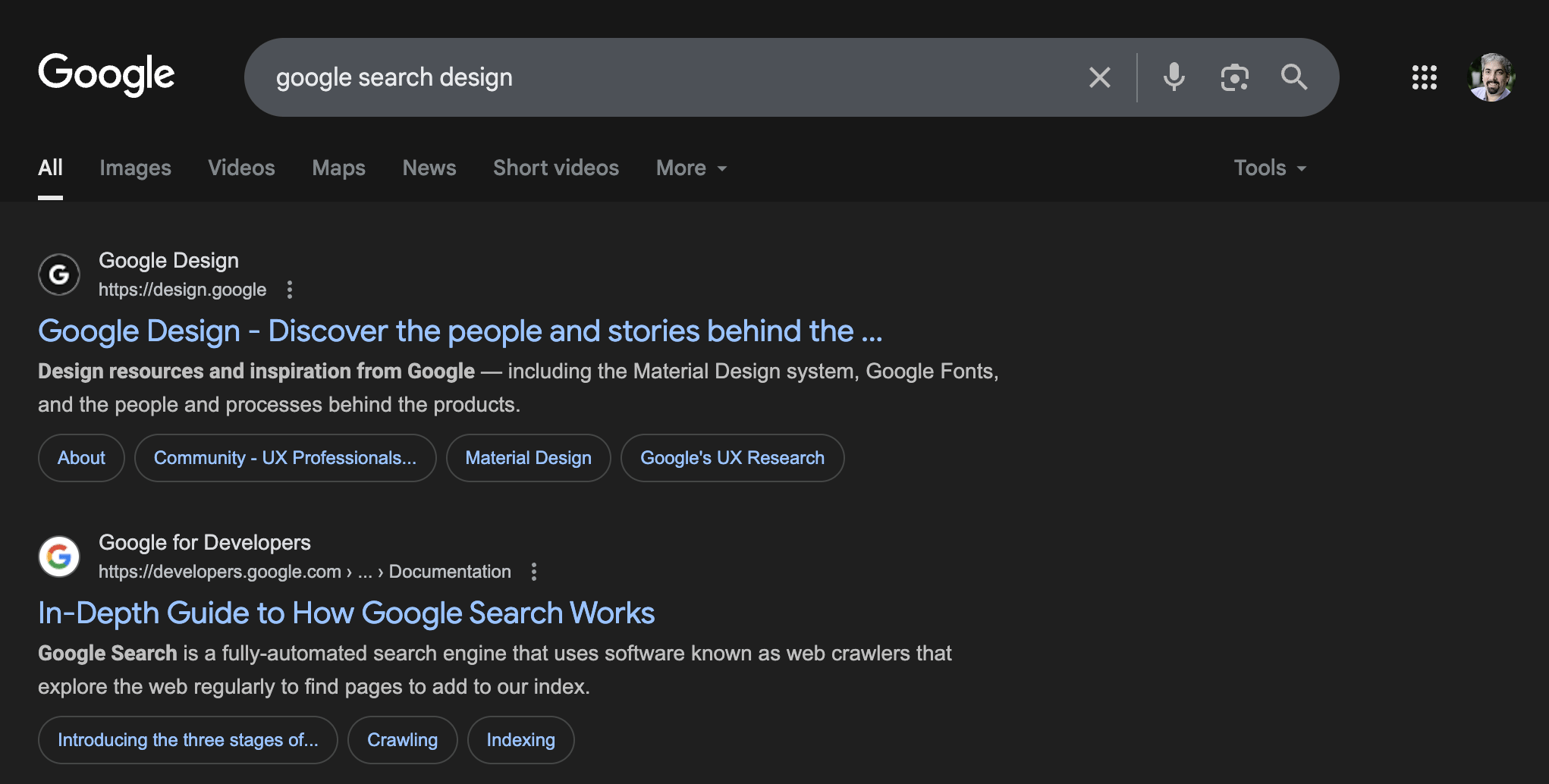
Version One – Dark:
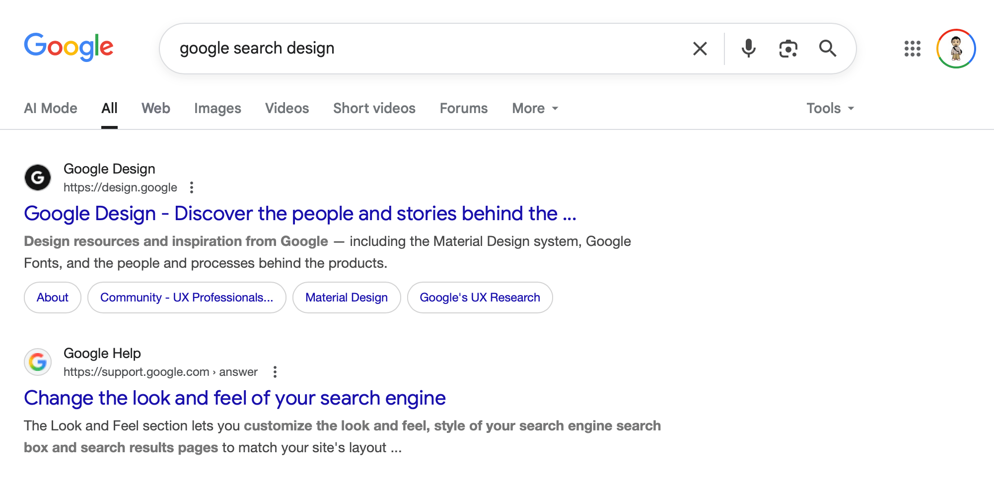
Version Two – Light:
Version Two – Dark:
Version Three – Light:
Version Three – Dark:
What do you think of these variations and do you see others?
Forum discussion at X.